Compound Investor
Compound Investor is a fictitious financial company who wants to educate adults in financial literacy.
The Goal
Design a website and app that will help educate adults about budgeting and saving.
My Role
UX researcher and designer
Project Duration
6 weeks
Background
This project was an assignment for the Google UX certification program. The project objective was to design a website and mobile app for social good. It was carried out without a team and the theme was chosen through a random theme generator.
Challenges
Dividing the app and website content
Devices impact how users use financial tools and services. Compound Investor needs to understand how to best serve those needs on the app and website.
Covering various topics
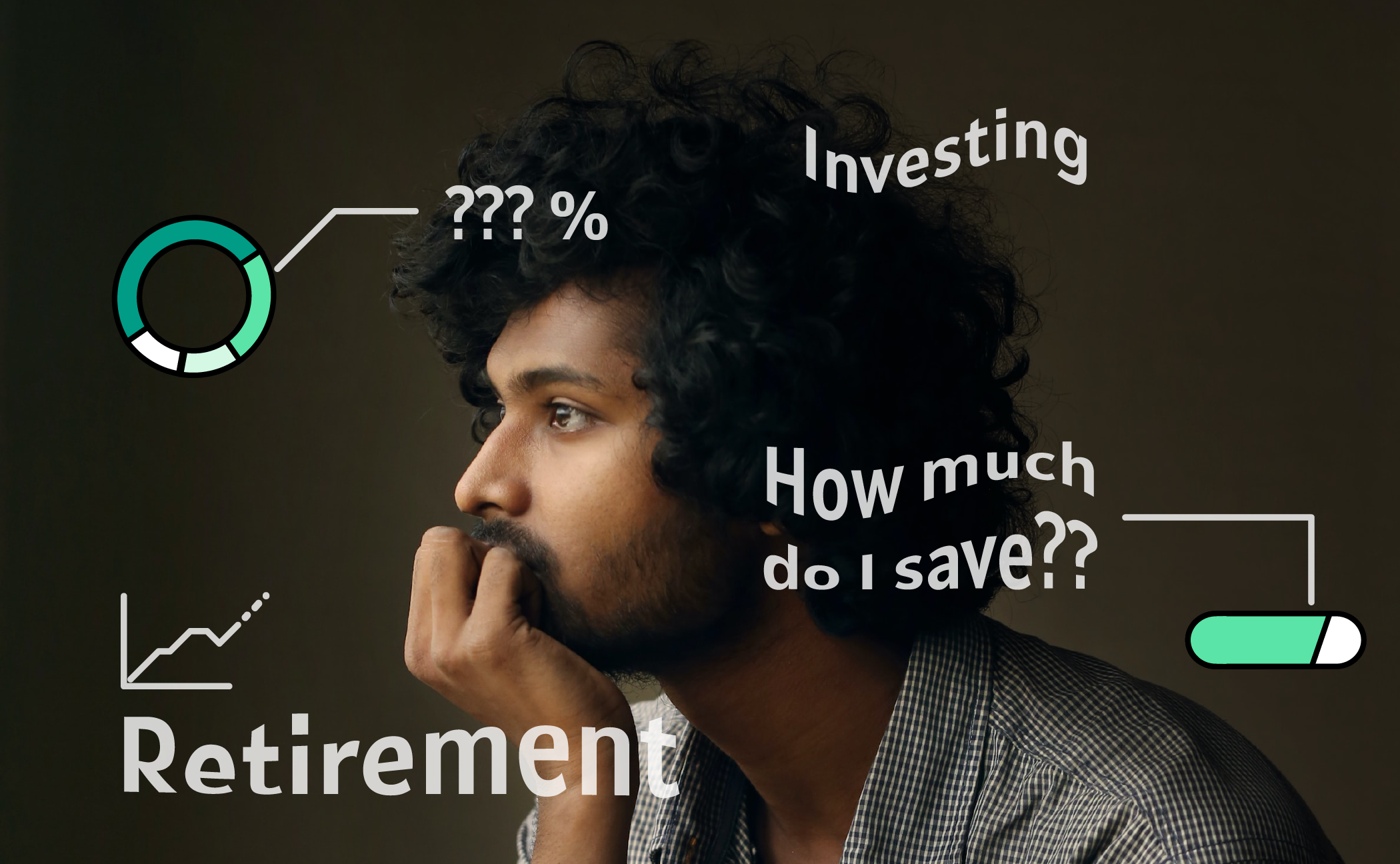
From budgeting to retirement, financial literacy isn’t one size fits all. With different life situations impacting users, there needs to be a way to inform users on various topics.
Time
The project needed to be complete on a time schedule of 6 weeks. This limited the number of participants and who I was able to gather.
Responsibilities
User research
Conduct interviews
Create digital wireframes
Prototype
Conduct usability studies
Iterate on designs
Research
Competitive Analysis
My goal for the competitive audit was to see what the budgeting and saving services are within any specific company. I wanted to know specifically what they did to add financial literacy to their target audience. There are multiple financial websites that focus on a variety of topics. There are also multiple apps that will help users budget and keep track of their finances.
Creating a profile of each company (including their target market, website or app navigation, content, and layout) helped create understand the current situation in the field of personal finance.
Discover:
Where do you look to for financial knowledge?
What tools do you need to help manage finances?
What financial topics are concerning due to lack of knowledge?
And understand:
How might we help users get excited to budget and have a savings goal?
How might we educate users about finance?
Interviews
After considering the information different companies offered, from budgeting to retirement,
I conducted interviews with adults between the ages of 27 to 60 who have a range of financial knowledge.
Building Empathy
Using the data from the interviews, I created a persona to empathize and prioritize goals according to what they need.
The Design
Information Architecture
Through a competitive audit of multiple apps and websites, I was able to build a site map to cater to the user’s needs.
Wireframes
In the wireframes, I wanted to split it up into two sections. App wireframes that would help users budget and save. And wireframes for the website that would educate users about finances.
Low Fidelity Prototype
That lead up to the creation of two different low fidelity prototypes for the company.
Visual Design
The style guide was created by determining the color palette from mood boards, using a UI kit, and making iterations until it came into one cohesive look.
User Testing and Iterations
After the low fidelity prototype was completed, participants were gathered for an in person usability study. I tested the budgeting and savings flow from the app and the navigation structure of the website.
Main take away from user testing:
Create inclusive language.
Words like “rent” or “car” creates assumptions about the user that may not be true.
Chunk the data into smaller bite sized pieces.
Have a more in-depth form when creating a savings goal.
This led to changes in wording used in the app and an increase of infographics used to display data.
Outcome
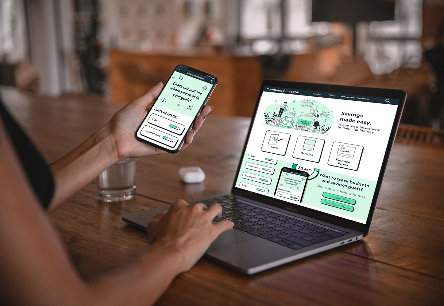
In order to create a product that tackled both general financial knowledge and provided specific tools to enhance the user’s personal budgeting and saving, the website and mobile app was split into two different experiences. The website provided users like Leanne the resource to learn about the basics of finances and the app gave the tools to put that knowledge she learned from the website into practice.
Lessons Learned
If there was an opportunity to expand on the project, I would like to create a flow to link the user’s credit card or bank account so they could have more accurate budget reports. This would also lessen the amount the user error when typing information and can save time. Key lessons that I learned along the way include:
Inclusivity of language
Just how the design of products is vital, so are its words. The wrong wording can alienate a user from a product.
Apps and websites can enhance each other
Instead of having a one size fits all solution for the user, sometimes it’s better to split up different tools and information on the website and app.


